Reporting on UXPA2019: How to connect usability testing to design, Part 2
Sayaka Kameyama - UX ResearcherAs a continuation from my previous post, I will continue discussing the content I presented during the UXPA poster session.
Last time, I introduced the tendency to directly incorporate user feedback in design decisions. I explained that this trend may cause discussions to stall if feedback is implemented at the discretion of system requirements and business strategy, or causes the field of design solutions to narrow.
How to make use of user feedback
The key to producing designs that solve user problems is to gather the "facts" (user behavior and thoughts) and to then understand the "why" behind those facts. By thoroughly understanding the why, the issues to be resolved should become clear. Even if discussions derail, the why serves as a place to return. To explain, I'll discuss the example car rental site used in my presentation.
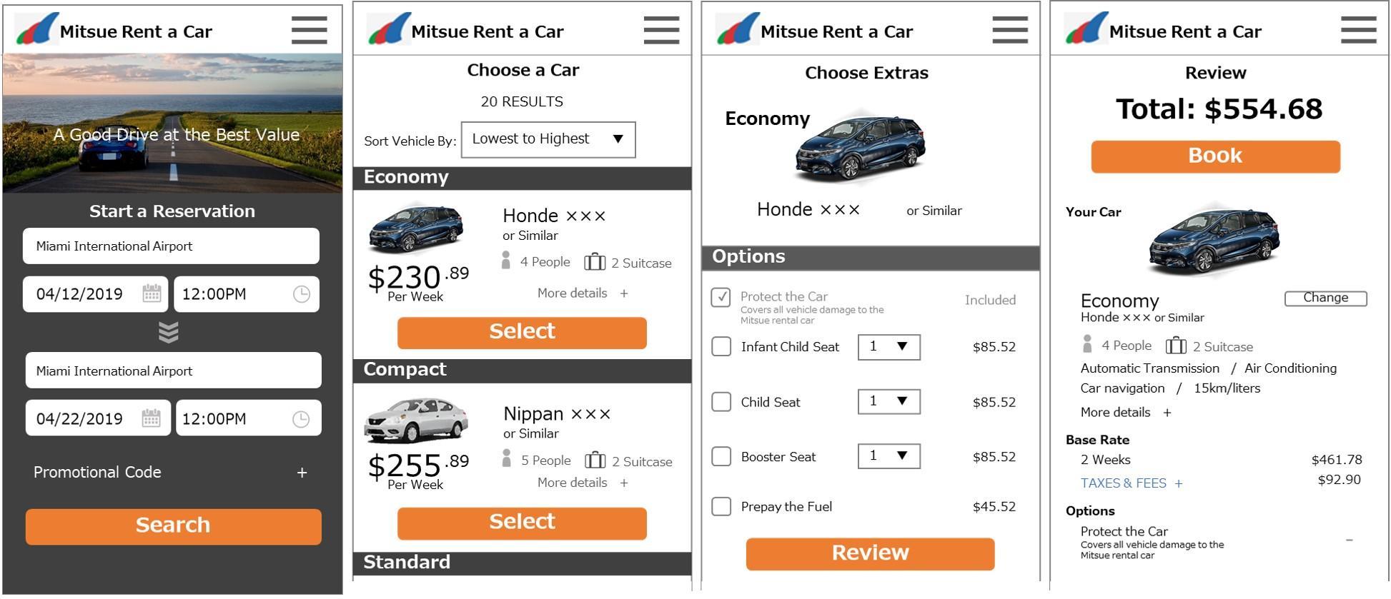
The task for usability testing was to book a car to be picked up and returned at Miami International Airport. The user was asked to rent a car for a trip with three friends between April 11 and April 22, an 11-day period. They could select any model of car they wanted.

Sorting the facts
To determine the reasons behind problems users encounter during testing, observations of user flows and behavior during testing should be recorded as facts (user behavior and thoughts). Here, it's necessary to think beyond the viewpoints and reasoning of stakeholders and researchers.
Site flow
- prices for different models of car are shown as per week rates, although the user had already selected a rental period of 11 days on the first page.
- afterwards users select car options, the final total price is then shown on the confirmation screen.
- the rental price is automatically calculated as the fee for 2 weeks because of a package deal where the total fees for each additional week are discounted if the rental period is longer than 4 days. (For the purposes of this test, the total price includes a 2-week basic rental fee to cover 11 days, plus insurance and state tax).
Observations from usability testing
- there were many users who were surprised by the price shown on the confirmation page and kept going back and forth between the "select a car" and "confirmation" pages.
- one user said, "it would be nice if I could see the total price from the beginning".
Determining the why
Using the gathered facts, think about the usability problems. Focus on deducing the reasons behind actions and comments by asking questions such as "why was the user surprised by the price on the confirmation page?" and "why was the user unsatisfied with the total price?"
Analyzing the problem
The basic fee structures were not clearly understood by the user (for the purposes of this test, the rental period was 11 days, so the fees were for 1 week + 4 days and calculated as 2 weeks as explained earlier). On the "Confirmation" page, the price was $554, which was the fee for 2 weeks, plus insurance and tax, but on the "select a car" page, the price was the 1-week fee of $230, which was a major difference. The confirmation page price was nearly double that specified on the "select a car" page. Such a difference confused the user, which was why during testing, they kept going back and forth between the "select a car" and "confirmation" pages, one user also stated that it was difficult to understand the total price.
Once the causes of user problems are understood, proceed to solving them. In this case, there was a significant difference between the actual total price on the "confirmation" page and user perceptions of what the price should be.
Multiple approaches should be considered, such as:
- making changes to the wording on the "confirmation" page so the user clearly understands the fee breakdown
- inform the user how the total price is calculated at an earlier stage
However, just understanding the causes of problems (the why) isn't enough to come up with practical design solutions. I will share tips on how to realize such designs in my final post in this series.
