Reporting on UXPA2019: How to connect usability testing to design, Part 3
Sayaka Kameyama - UX ResearcherThis is the final part of my trilogy of blog posts on the UXPA poster session. Previously, I discussed how to consider user feedback. By grasping the why behind user actions (facts) during usability testing, you will be in a much better position to solve user problems.
Recap of previous posts

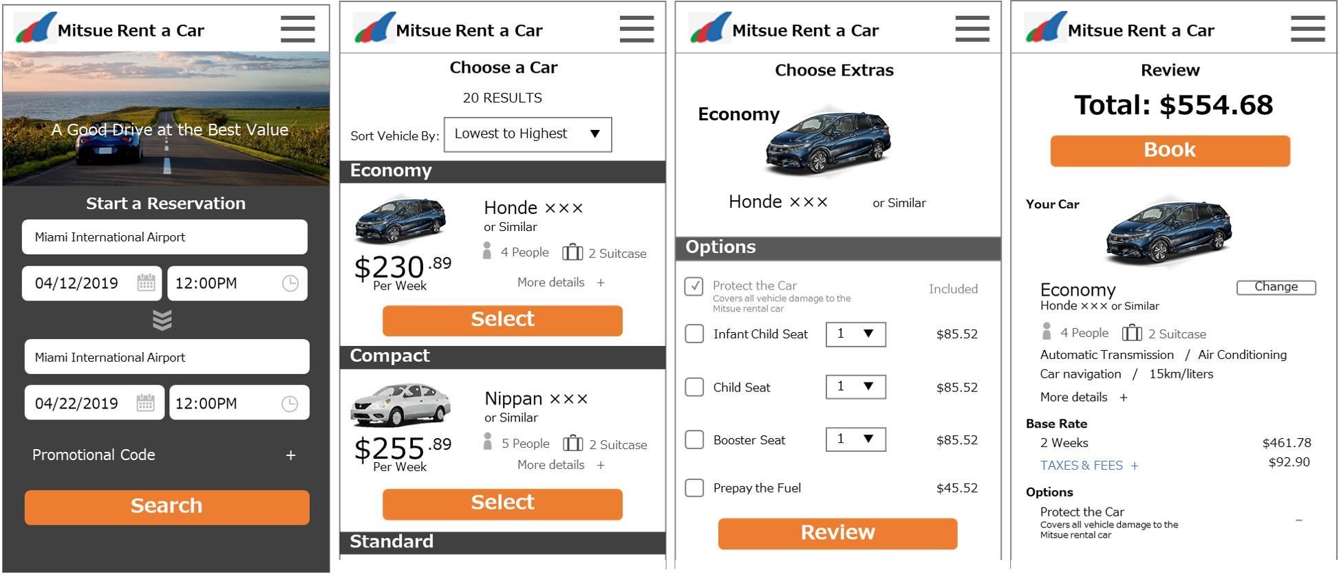
- during usability testing, users were surprised by the total price on the confirmation page and said that it was difficult to understand total fees
- users were not able to confirm the basic fee structure, so there was a large gap between user perceptions of what the price should be and the actual fees displayed on the confirmation page
- approaches such as "making changes to the wording on the confirmation page to inform the user of the fee breakdown" or "providing notice of the calculated rate at an earlier stage" can be taken to solve user problems
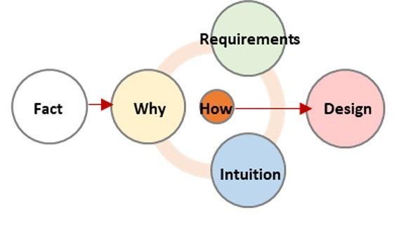
However, to devise a solution that works, ideas formed through intuition as well as requirements including business strategy and system specifications must be considered. This meeting of the whys, intuition, and requirements are where designs that solve user problems can be found.

Dealing with ideas formed through intuition and requirements
From the viewpoint of a researcher, it's common to assume that after understanding the reasons behind user problems (the whys) they can jump straight to figuring out solutions (the how). However, it's necessary to deal with ideas formed through intuition alongside the requirements. No matter how much thought is put into the reasons behind user problems (the whys), without meeting requirements such as business strategy and system specifications, these solutions cannot be implemented. Furthermore, there may also be times when inspiration comes from observations made during usability testing (the facts). Often these are ideas that researchers come up based on their experience and can be hard to ignore. However, instead of simply adopting those ideas, working through the causes (the why) and requirements before thinking about solutions (the how) and doing some fine-tuning will enable creation of designs that solve user problems.
Examples of designs based on intuition
- can the total price be shown directly on the "select a car" page?
- the pages are repetitive. It seems like the content on the options page can be reduced, and users can be shown the total price directly.
Examples of business strategy and system specifications
- the target users, which included those who were recruited for the tests, are those who don't fuss over car specifications.
- in order to ensure the lowest prices, there are only 8 car models.
- competitors show prices by weekly rates. If users want to compare weekly rates with competitors it will be disadvantageous if only total fees are shown, so weekly rates should be kept.
- the UI flow can be changed provided the location, dates, car model selection, and options are kept for fee calculation purposes.
Connecting with design
By integrating the identification and understanding of the why, ideas based on intuition, and requirements, the path to solving the problems (the how) will become clearer. In order to realize the how, make changes to the design by fine-tuning the UI.
Examples of solutions
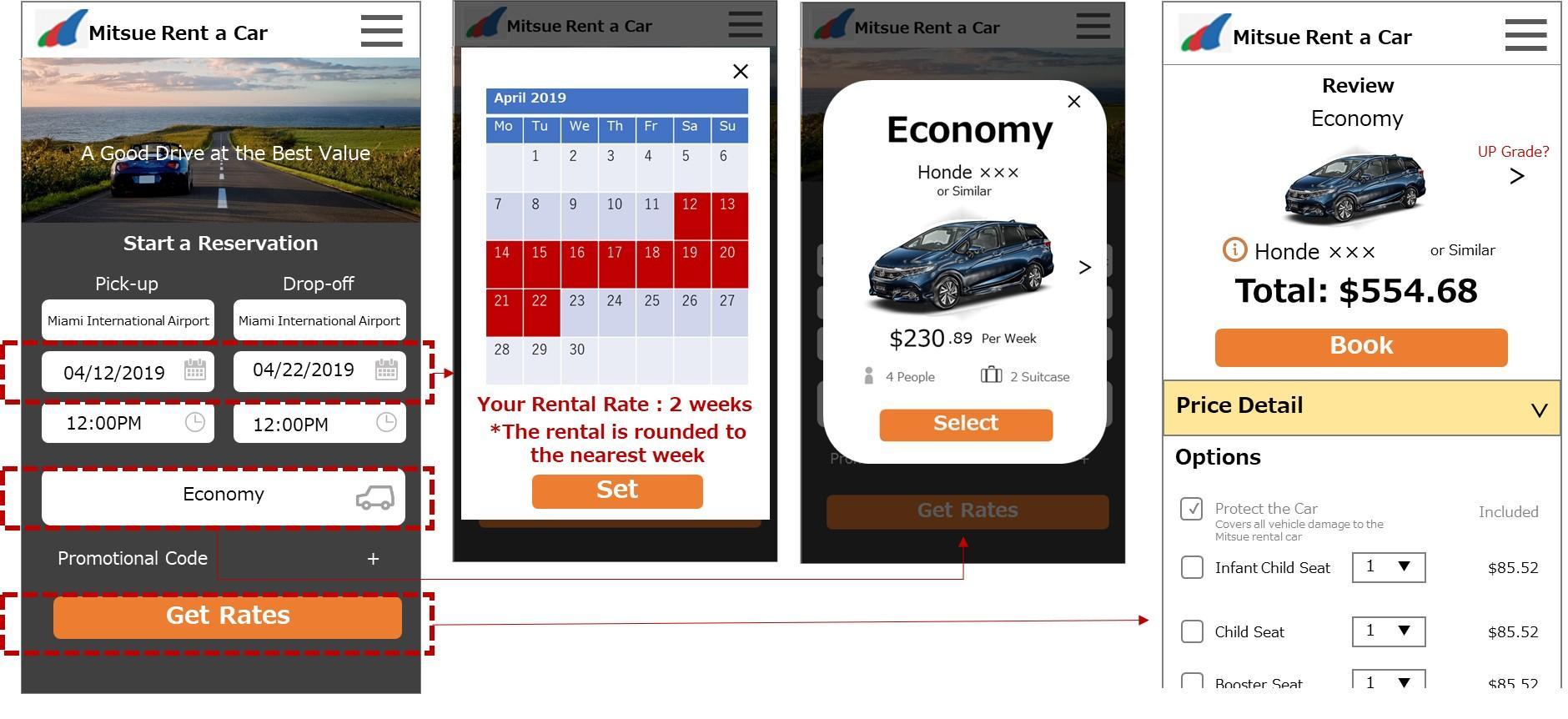
- clearly show how the rate is calculated (whether the rate is 1 week + any additional days, or 2 weeks)
- help the user to immediately understand the total price by carefully adjusting the interactions between pages. Make the user journey shorter by having the user select car model upfront and putting options and confirmation of details on the same page.
Examples of specific UI improvements
- explain how rates are calculated for the user specified period within the popup box where dates are selected.
- make it possible to select a car model upfront. Leave only the minimum required information and request the user selects from the 8 car models by swiping through their options (keep the weekly rates).
- assuming the options and confirmation of pricing details can be integrated on the review page, show the total fees directly after the first page.
- the form submission button on the first page says "search" currently, but "get rates" will help the user to understand how rates will be calculated.

As can be seen with the above, the proposed solution based on direct user feedback, which was to show the total fees on the car selection page (covered in the first post in this series), is very different from the final suggestions. Because the focus of usability testing is user feedback, which carries much weight, it's easy to fall into the trap of directly implementing user comments into solutions. This often makes solutions too restrictive or impossible to implement due to business or system requirements, in which case the problems that took effort to identify may not be solved. To prevent this, it's important to thoroughly analyze and reason through the context and user ways of thinking behind their words. When business and system requirements are brought to the table, make sure to go back to the root causes, and think flexibly about different possibilities from various angles. In order to achieve a design that solves the user problems found during usability testing, it's essential to fully consider user actions (the facts), ideas formed from intuition, and requirements, rather than merely implementing user feedback directly into solutions.
